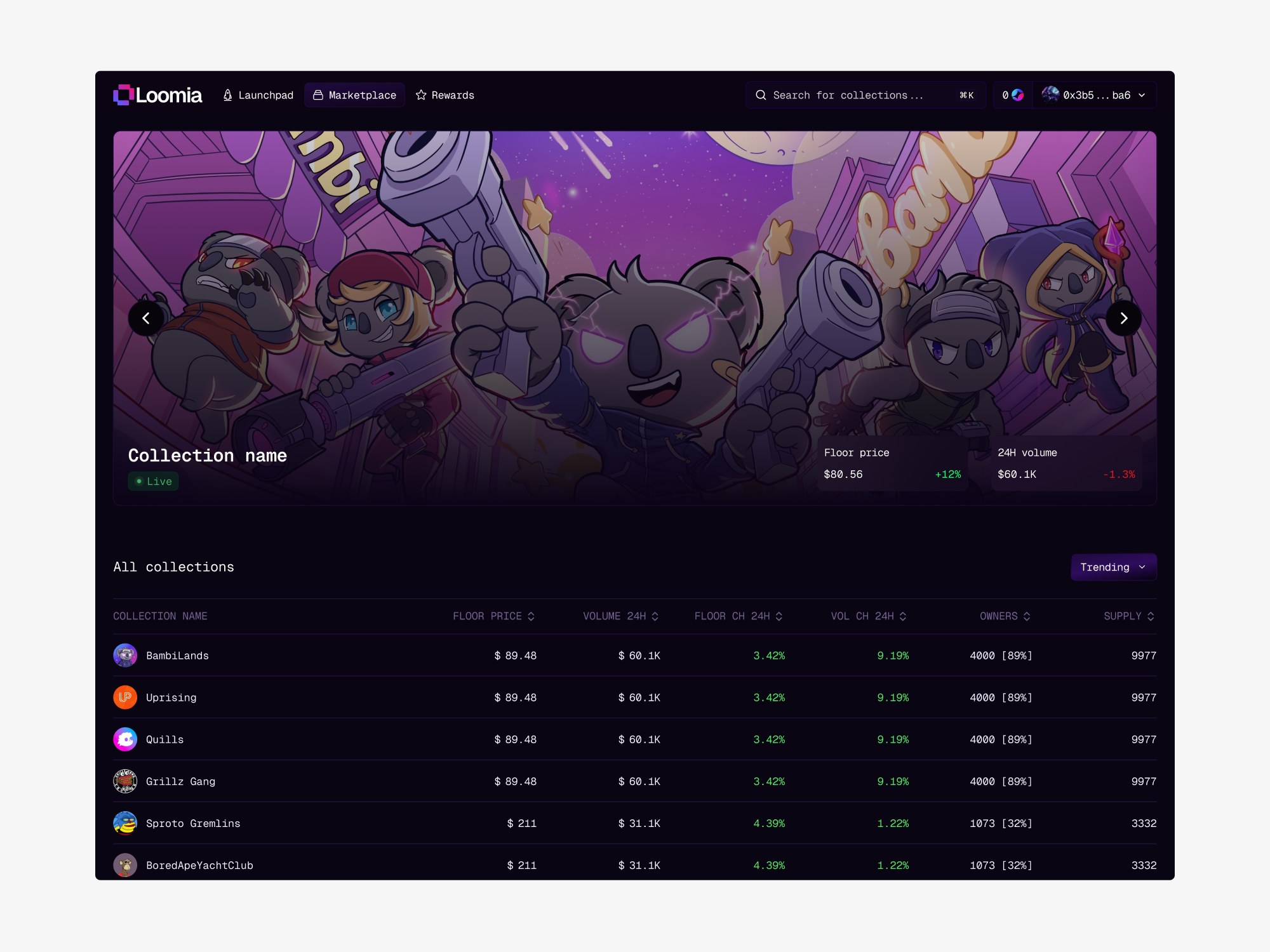
Loomia needed a full NFT marketplace on the Somnia blockchain — marketplace, collection pages, creator profiles, wallet interactions, NFT detail, activity feeds, responsive across all of it — designed from nothing in three weeks, with one founder and one developer.
That timeline is the whole story of this project. It decided what got designed, what got reused, and what got cut.
Art first, data second
Marketplaces drift toward the spreadsheet: floor price, volume, 24h change, supply, owners, rank. All of it matters to a trader and all of it competes with the thing people actually came to look at.
So the hierarchy went artwork first — large, uncropped, given room — with marketplace actions kept within reach but never above the work. Discovery runs through curated listings, categories, and trending rather than through a filter panel, because browsing is how most people arrive at a collection they didn't already know they wanted.
Marketplace home, a collection page, and the trending and category views. (3 screens)Every collection tells its own story
Collections arrive with their own art direction, and a marketplace that flattens them into identical cards throws away the thing that makes each one worth buying. Creator profiles, collection pages, NFT detail, and activity feeds each give a collection room to look like itself, while the surrounding chrome stays constant enough that you always know where you are.
Creator profiles, NFT detail, and the activity feed behind each collection. (3 screens)Three weeks, one marketplace
Wallet connection, and the same screens carried down to mobile. (2 screens)Three weeks doesn't buy exploration. It buys one good decision made early and held: define the components before the screens, then compose rather than draw.
InsightWhat a three-week build actually cost
Wallet connection, marketplace interactions, and every responsive breakpoint came out of one component set built in the first few days — cards, plates, tables, and the collection header. Once those existed, most screens were an assembly job rather than a design job, which is the only reason the surface area fit the calendar.
What that bought: consistency for free, and a developer who could build ahead of me because the pieces stopped changing.
What it cost: no exploration of a second visual direction, and no usability testing before launch. On a longer engagement I'd have spent week two proving the browse-first hierarchy with real collectors instead of arguing it from first principles.
Where it landed
The marketplace shipped on Somnia with the full surface designed and built: marketplace and collection browsing, creator profiles, NFT detail, activity feeds, and wallet flows, responsive from desktop down to mobile.